

On photographs THESE shades in clothes look classy + See which colours to avoid!
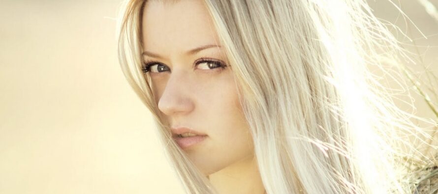
OHMYGOSSIP – It is obvious that everyone wishes to look good in pictures. One of the main factors in a good outcome is what colour clothes you put on, mediates Who What Wear.
It is true that some colours look better in pictures than others. “Plain clothes are better that those with patterns. “Mild pastels and white always appear worn out in pictures,” says the director of Pantone colour institute, Lee Eiseman. Yet Eiseman adds that should you still decide to dress up in pastels or in white then good make-up will help turn the situation to your benefit. A photo make-up made by a professional is the best solution.
And also, there are these colours that just look amazing in photos. “The best colours are deep red shades, greenish-bluish/turquoise and other blue and green shades. The richest result comes from deep green, lilac, and blue, ” says Eiseman. “Those who prefer the more neutral tones, then grey is better than black. Rustical and brown shades are also good. Black and white put together might give too great a contrast. Bright pink, light pink shades and coral appear attractive,” adds Eiseman.
Photo: Pexels
Source: Ohmygossip.ee
 High quality & nature friendly luxury cosmetics from Scandinavia - ElishevaShoshana.com
